
COOPER HEWITT
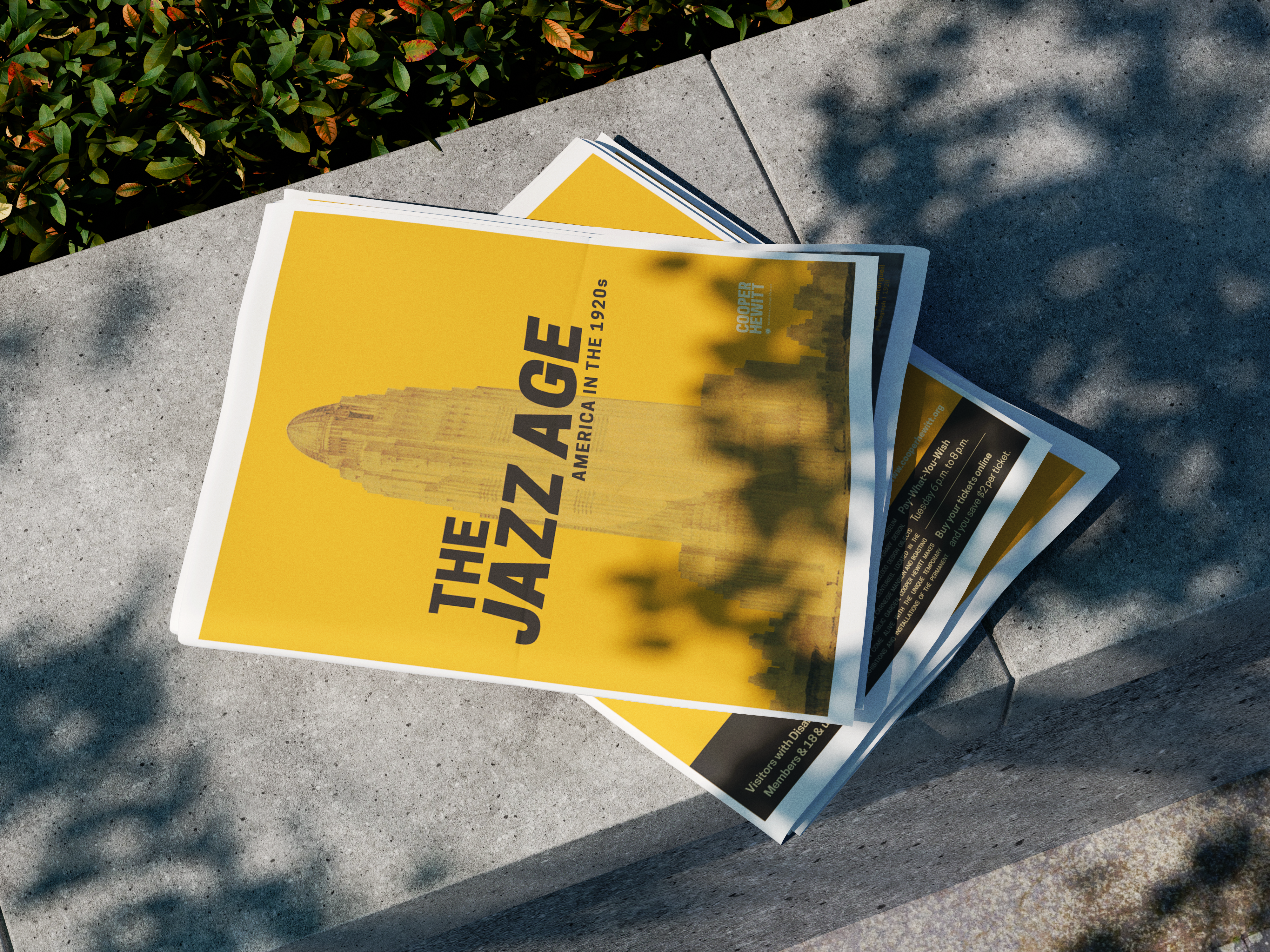
Cooper Hewitt: The Jazz Age
Designing a publication that pulls you through the era, not just past it.
The Jazz Age: American Style in the 1920s is one of Cooper Hewitt's most visually rich exhibitions. The challenge was designing a publication that actually matched the energy of the era it was documenting. Museum publications have a tendency to feel like catalogues. Dense, academic, something you reference rather than actually read. This one needed to feel different.
The Jazz Age covers a period where design, fashion, music, and architecture all collided at once. The challenge was translating that kind of cultural energy into a print publication without it feeling like a textbook. People engage differently with historical content when it's framed as a story rather than a catalogue. That was the direction from the start.
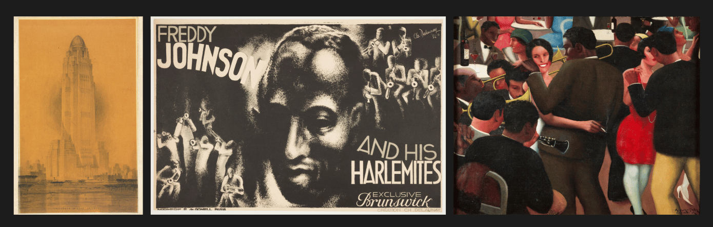
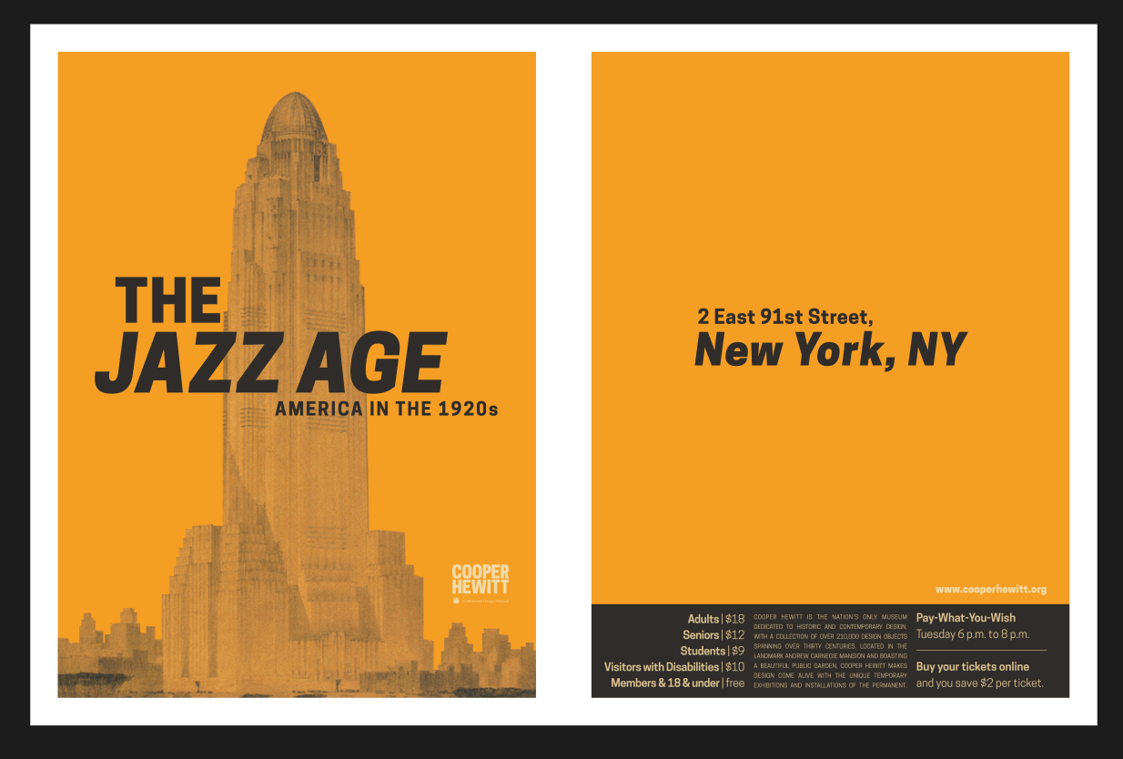
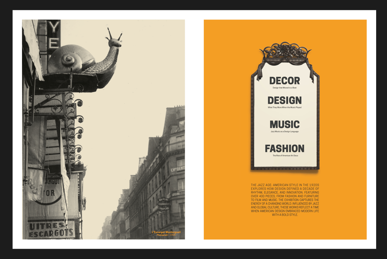
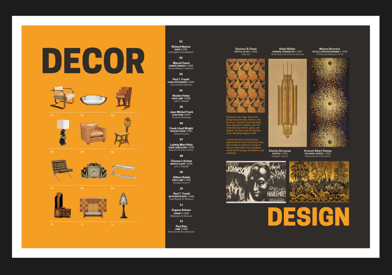
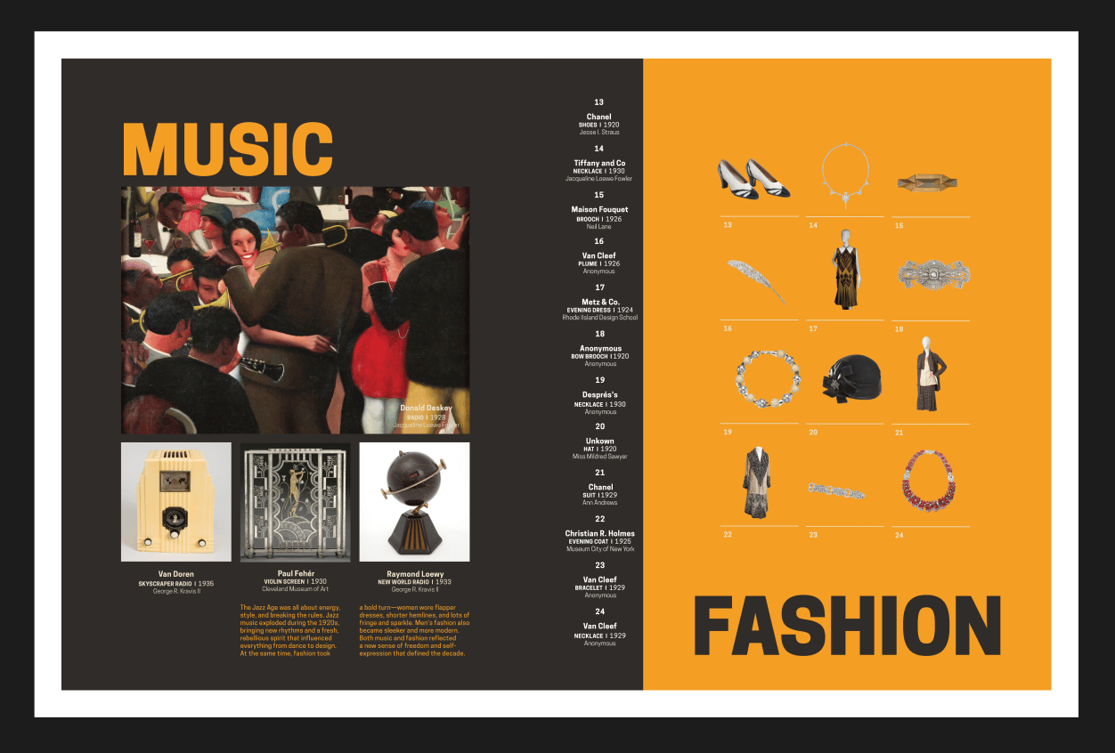
The publication is built as a structured editorial narrative rather than a series of isolated layouts. Strong typographic hierarchy, deliberate pacing, and carefully curated imagery work together to create a sense of rhythm that mirrors the energy of the era. Art Deco visual references, a restrained color palette, and balanced compositions keep everything feeling of the period without being a costume.
This publication was designed for people who respond to design before they respond to text. Students, creatives, casual museum visitors. The layout decisions aren't decorative. They're the argument.
Bold section headers create clear entry points. Body text stays readable across longer passages. The relationship between type and image creates a rhythm across spreads that lets the content land the way it should. Image sequencing, spacing, and typographic hierarchy do the navigational work so the content can just breathe.
Open to full-time, freelance,and collaborative work.
hello@landoncooke.com
hello@landoncooke.com
